
Product strategy & End to end app development
Synopsis
This case study tells the story of how the app project evolved - from an initial brief rooted in the wrong business model, setting the app on a path to fail to evidence-led research that reframed the challenge and delivered a scalable, user-focused app that supported real growth. You’ll see how I uncovered insights, reframed the challenge, and guided the design process to balance user needs with business goals.
Contents
Business Overview
The initial brief
User Research Overview
Research insights that redefining the path forward
The MVP Solution
A Retrospective
Business Overview
Network Digital Marketing operate in the discount space, partnering with leading retailers to provide exclusive offers to keyworkers across the UK. Our members span four distinct groups - healthcare professionals, teachers and education staff, carers, and charity workers - each served through a dedicated brand and website.


The problem
By summer 2024, we were a web-only business relying on email as our main CRM channel. Member engagement was low, users visited just 1.2 times per year - leading to high churn and poor retention. To compensate, the business focused on acquisition-driven growth, but without increasing repeat usage and loyalty, this strategy was unsustainable and risked losing relevance in a competitive discount market.

Project Brief
With the business primarily focused on user acquisition, expanding the tech stack and CRM channels. So the brief was clear:

One app for all
iOS anti-spam rules meant multiple near-identical apps risked rejection, so the business committed to building a single app serving all four brands.

Managed by 1 CMS
Deliver a familiar experience aligned with existing web journeys, so content could still be managed seamlessly through the existing CMS.
User Research Overview
Designing the app started with research. I needed to understand not only how our members used the website, but also the wider market, competitors, and internal business requirements. This research spanned multiple sources and methods; from competitor and market analysis, to quantitative and qualitative insights, to stakeholder interviews. Starting with research ensured that every design decision was evidence-based and aligned with both user needs and business goals.
Stakeholder Research
I spoke with teams across the business — from CRM and web teams, to developers, partnerships, and experimentation — to understand their goals and requirements for the app. This ensured the platform supported campaign delivery, displayed offers correctly, and aligned with broader business objectives.
Competitor Research
I analysed competitor apps, web journeys, and reviews from Blue Light Card, Student Beans, UNiDAYS, VoucherCodes, and others. The goal was to understand typical user journeys, uncover pain points, and identify opportunities for differentiation. By addressing gaps in the market and learning from what competitors do well and bad, we could design an app that has a competitor edge and delivers real value to users.
Quantitative Research
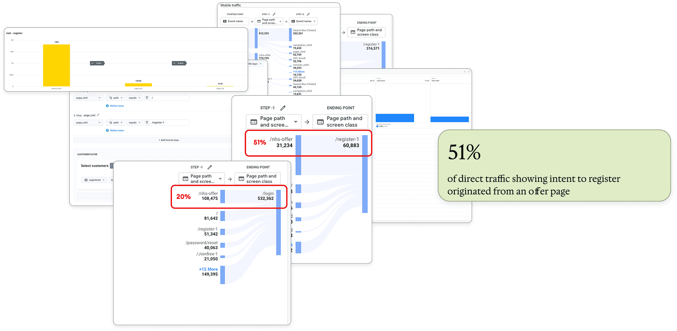
Using Google Analytics 4, FullStory, and Tableau, I analysed behaviour from both logged-in members and guest users. I explored how journeys differed by acquisition channel (direct, organic, social, email, paid), where users landed, the paths they took, and the quickest routes to conversion. These insights helped inform the app’s structure and prioritisation of key flows.

Qualitative Research
I spoke directly with members and target users through panels and focus groups, including users of our competitors like Blue Light Card. Different designs and user journeys were presented in these studies to gather insights on what members value, their pain points, and how they respond to different flows. These findings guided design decisions and prioritisation to ensure the app met real user needs.
Experimentation
I used Bloomreach and ABTasty to run experiments, validating design changes and building confidence in new layouts and fundamental updates to the rules. By testing any changes to UI, experience, or journey against conversion metrics before development, we ensured the app improvements were both user-focused and performance-driven.
Research Summary
This research ran throughout the design process, providing solid evidence to guide decisions. The combined insights from users, competitors, stakeholders, and experiments revealed groundbreaking opportunities that shaped both the app’s design and the overall project strategy.
The research that led to a strategic pivot
The original brief was clear: create one app to serve all our audiences (members and visitors of the 4 demographics).

However, from the outset, this created tension between business goals and UX considerations. On the business side, speed to market was critical, and with over 70% of our member base on iOS, there were concerns that submitting multiple apps could risk rejection from the App Store.
From a UX perspective, my concerns centered on branding and trust. A single “super app” would mean a new, neutral identity - one that didn’t match the branding members already knew. This raised risks: members might not recognise the product in the App Store, and more critically, we would be asking users to hand over login details to a product that felt unfamiliar, potentially undermining confidence at the very first step.
What now?
Whilst this debate continued, I turned to user behaviour research to ground the discussion in evidence. By analysing popular web journeys, a clear pattern emerged: if not already logged in, visitors preferred to search and browse offers first before committing to sign up or log in. In fact, 51% of direct traffic showing intent to register originated from an offer page.
Based on this insight, I proposed an onboarding flow that mirrored this behaviour — allowing users to browse offers before being asked to create an account or log in.
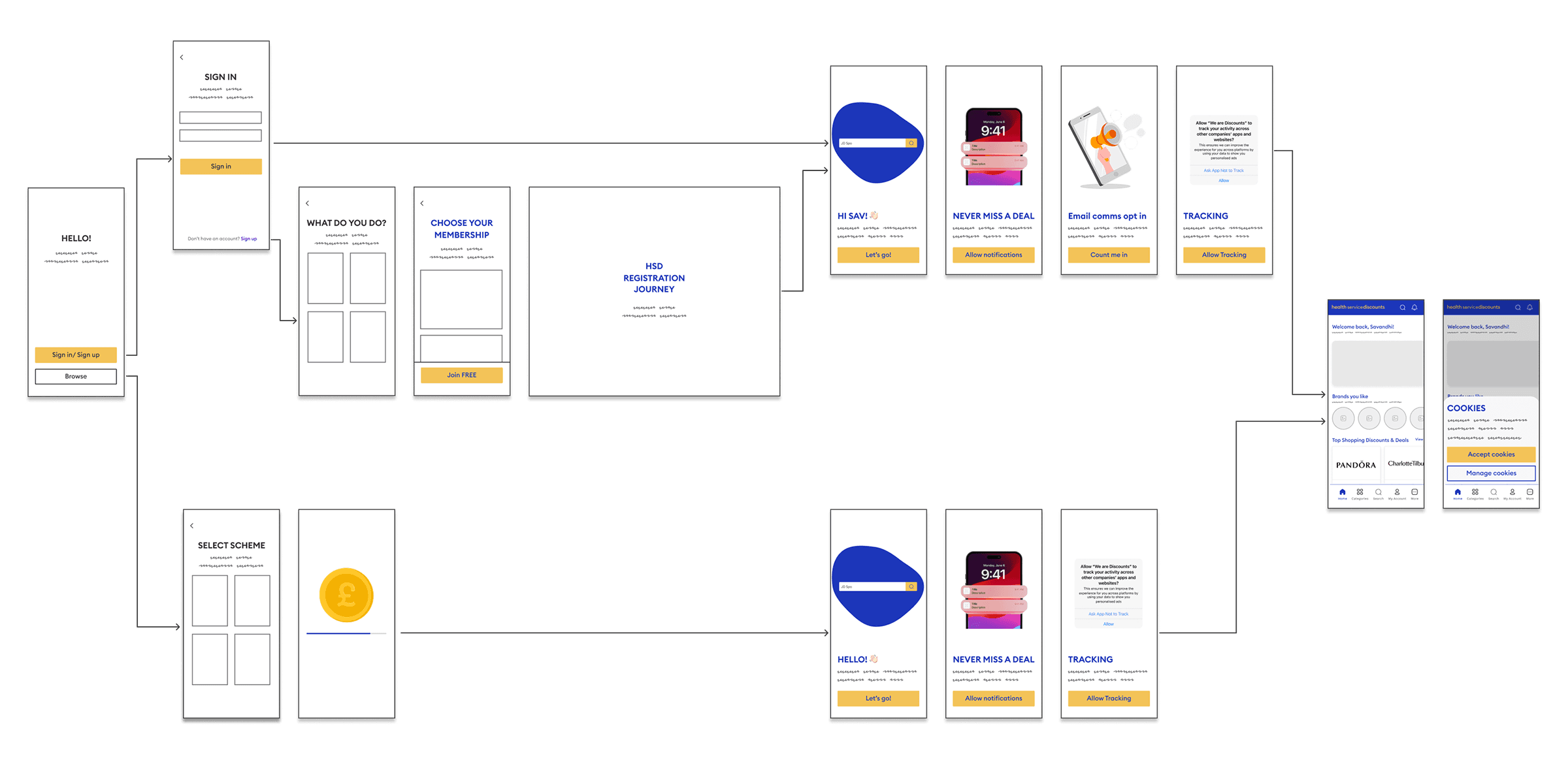
Road block: Onboarding complexities ‼️
When mapping user flows, we faced a major challenge: a browse-first experience added significant complexity and risk. With four member groups sharing one app, we couldn’t guarantee the right content without login. The solution was to remove browse-first entirely, requiring members to log in or sign up before accessing discounts.
Validating this change
To test the impact of removing the browse-first journey, I conducted qualitative and quantitative research using Userlytics, Bloomreach surveys, and SurveyMonkey. I spoke with both existing members and people matching our target demographic to understand expectations around app onboarding — specifically, whether requiring login or sign-up immediately after download would be a pain point.

Existing members
Comfortable logging in immediately, as they were familiar with the brand.

New users
Less keen to log in to an unfamiliar brand, viewing it as a barrier.
And there's more…
Another breakthrough insight from this stage of research was the reaction to the “one app for all” approach. Across interviews and surveys, existing members consistently described it as confusing. They expressed a clear preference for an app that felt tailored to their specific membership and community.
Participants also reacted negatively to the idea of a neutral, blended brand. Both members and those in our target demographic said they were less likely to download or trust an app that didn’t align with the identity they already recognised. This meant that neutral branding would not only weaken trust with existing members but also limit organic downloads.
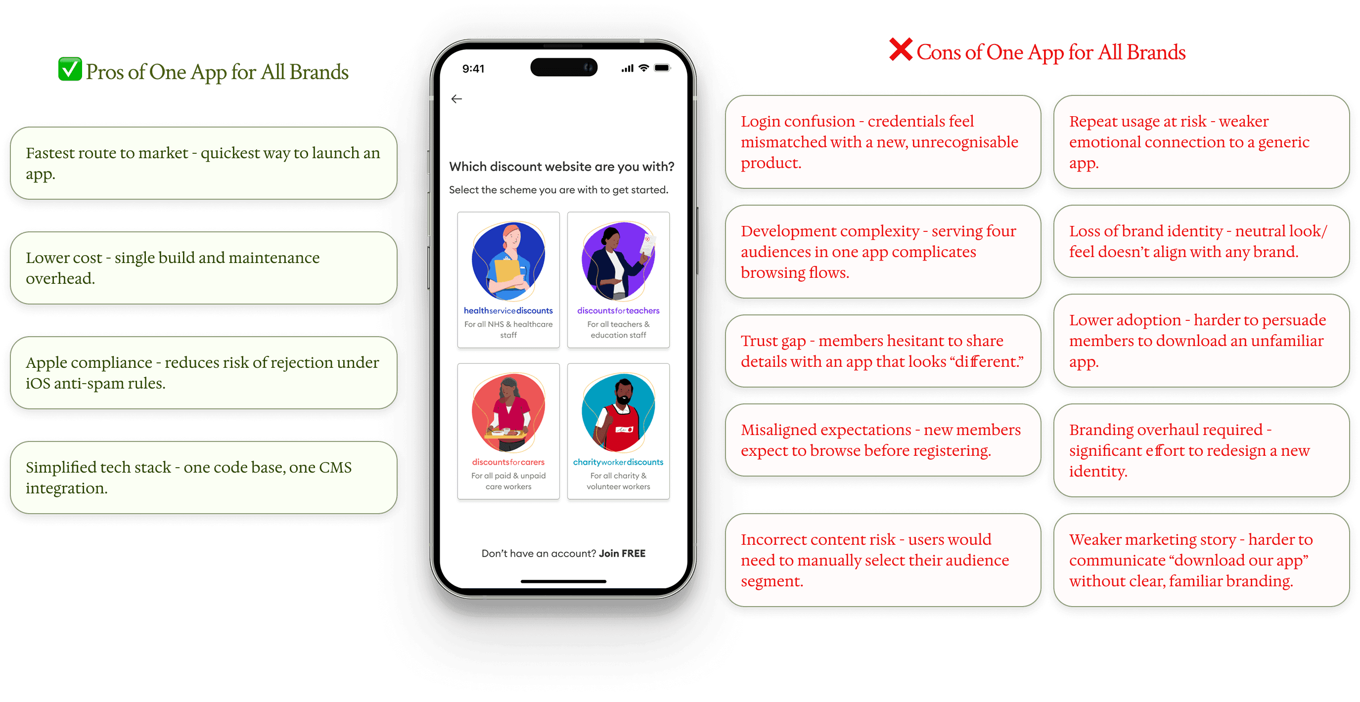
This insight reshaped the business perspective. It became clear that aligning each app to its brand identity was essential — both to build trust with members and to maximise downloads. The risk of a neutral “super app” was no longer acceptable.
Strategic Pivot ✅
As a result, the business came around to the pivot: we would build four distinct apps, one for each audience. This was a huge win — for members, who would gain a trusted, familiar experience, and for the business, which would strengthen loyalty and adoption in the long run.
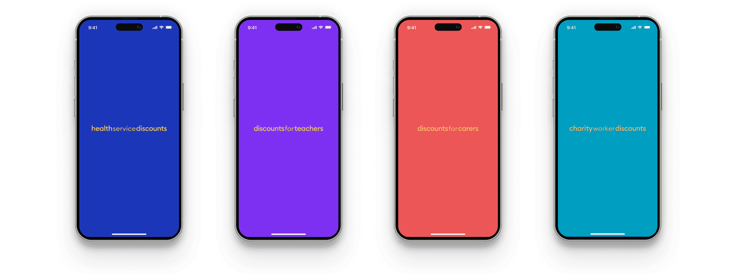
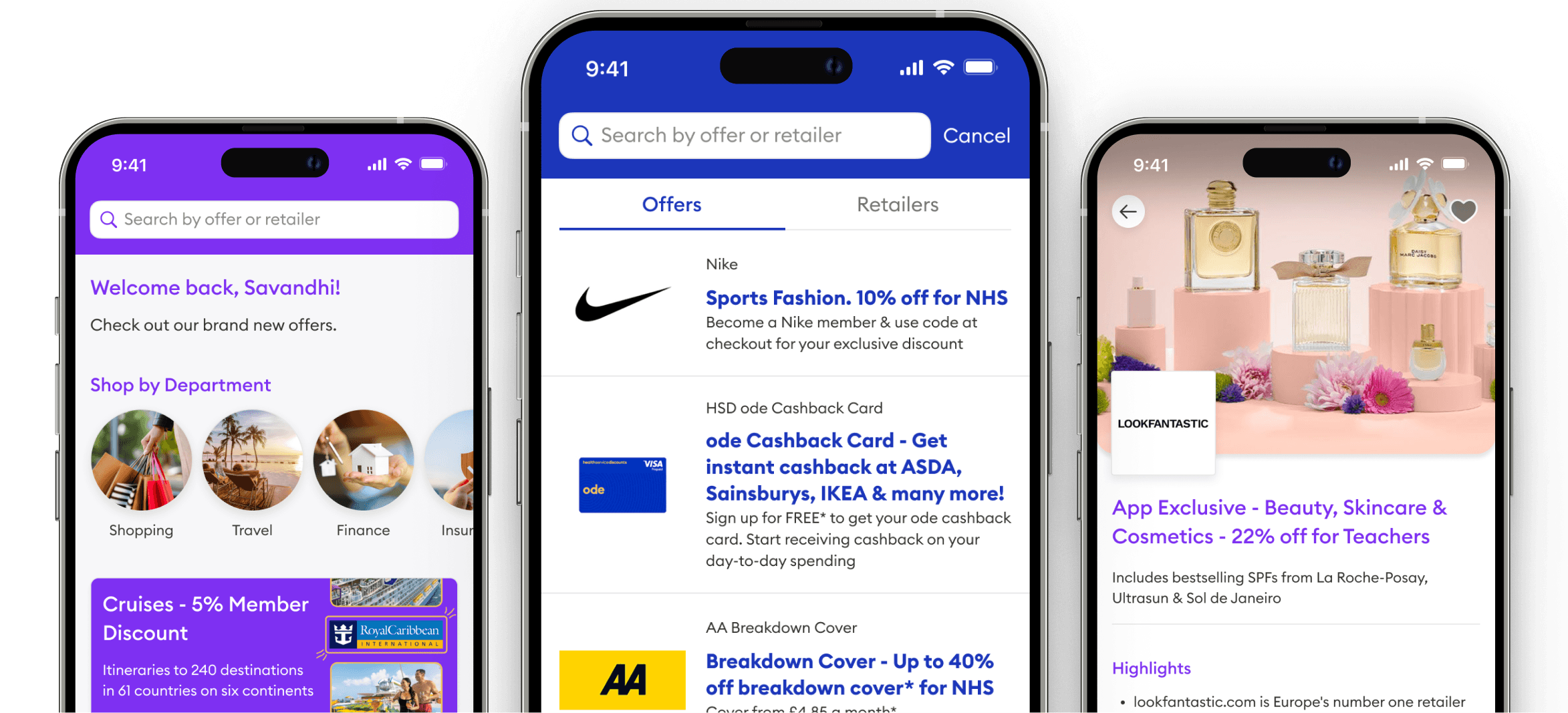
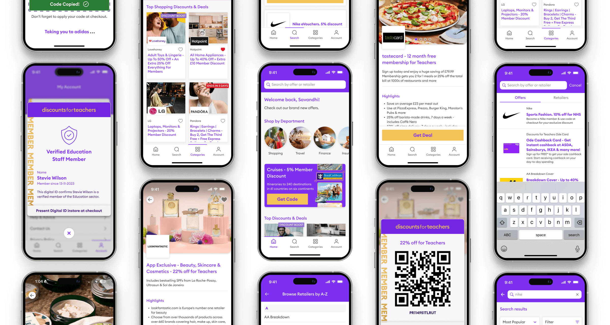
The MVP Solution
With the decision made to develop four separate apps tailored to each member group, the focus shifted to shaping the first version of the app. Although not covered in this case study, extensive additional research and experimentation informed the design, from optimising navigation and reducing cognitive load, to rethinking the code redemption journey and redesigning offer pages.
Below are some of the MVP product designs that were released to market.
A retrospective
This project reinforced that evidence beats assumption: research and experimentation were the levers that turned a misaligned brief into a viable, growth-driving product. Shipping a focused MVP forced ruthless prioritisation — we traded breadth for a testable core, instrumented clear KPIs, and validated every major change before development. The work also taught me how to balance speed-to-market with user trust (brand recognisability and segment-aware flows), and why modular, scalable design patterns are essential for rapid iteration. Strong cross-functional alignment and rigorous A/B testing reduced risk and accelerated buy-in. This was the MVP — since launch many new features have been through design and are currently in development to open up further products and richer member experiences.